
Five Minutes. Go!

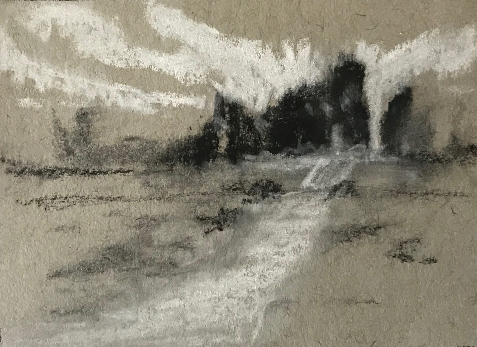
Composition #12, working on value masses.
Today I challenged myself to create my value composition in five minutes. The goal was to construct a landscape, loosely based on a photo I took at Arches National Park, with a focus on distinct value masses. I set my timer and got to work. When it buzzed, I took a few more minutes to see if I had a "papa, mama, baby" distribution of lights, darks, and mid-values. I didn't, so I reworked the composition a bit until I did. Success. Papa: mid-tones. Mama: white. Baby: black.

My finished landscape. 
I then worked out a color palette for my small (5"x7") test painting, choosing a triadic color scheme of yellow ochre, naphthol red, and both phthalocyanine blue and ultramarine blue. I added in titanium white and that crazy baby blue I'm using up (see it in the sky), and started painting. My goal: staying true to my value plan.

Overall, I'm pleased with my little painting. I think it holds true to my value plan, the color is attractive and holds true to the triadic scheme, and it's a pleasant scene. My only issue is that it doesn't express what I was feeling the day I took the photo, so I'm back to the studio to try a few different versions. I'll keep you posted on my progress.

Comments

Popular posts from this blog

Spring"Flow" Show Features Three of My Paintings

In January I embarked on a new self-imposed oil painting project/collection, with the goal of down-selecting three paintings for Dreama Tolle Perry's spring Flow membership  art show. Picking a subject for a collection and staying focused was a challenge for me; my mind is usually racing around in a million artistic directions. I knew I wanted something static, that I could work on without it changing. Fake flowers as a still life were the perfect choice! They wouldn't wilt in the direct studio light, and I could make them do whatever I wanted. Still, I wanted it to be simple, so I refined my collection subject a step further.  From left to right: Rose-Bauer Duet (oil, 6"x8"), Voodoo (oil, 6"x8"), and Peace (oil, 6"x6"). I own a single beautiful silk rose, bought at a specialty store last year. If I had to guess, it's modeled on the Peace hybrid tea rose. So I decided all ten of my paintings for the collection would be based on this single r...

Mean Critic Meets Scary Progress

I'm continuing to work on my value studies and bouncing all over the place, both with subject and with medium. I swear that one of these days I'll find my lane. There are things I like and dislike about oils, acrylic, and watercolor. There's not a perfect medium, but oils sure are easier for working on composition and value.  As the year is coming to an end, I'm wrapping some things up and getting ready to launch other things. I went through my last three years of paintings (about 150) and categorized them as keep for myself, make available for gifts or purchase, or repurpose (at first I had labeled them trash, but that just seemed so mean, and I really can use the paper for other things). With the gift/sell category, I created a PowerPoint file with all available paintings, categorized by subject. Each was labeled and priced...a scary declaration on my part that my creativity is valuable. In the coming year, I will use this file to create a new website for my growing a...

Value Epiphany!

For the new year, I've decided that before I start a painting, I'll note the goals for that painting session and/or the finished product if I'm not painting alla prima (in one session). I've sort of informally been doing this for the last couple of months, but now I want to consciously follow these steps: 1) write down my goals, 2) paint, 3) acknowledge that the painting is crap ( see previous post ), 4) note how I did or did not meet my goals, and finally, 5) create a next steps list. Of course, these steps won't be executed until I've done the all-important value studies! Last October I painted a lesson from Dreama Tolle Perry's Flow class , a cute carafe of cream with a white ceramic basket of strawberries. The basket didn't read "white" in my painting, which I didn't like, and I wanted to figure out why...but I wanted to use my own still life to do it.  So I set up a scene informed by Dreama but all my own. My scene used my own props to...